Visualize high-dimensional dataset in a 2D Chart.
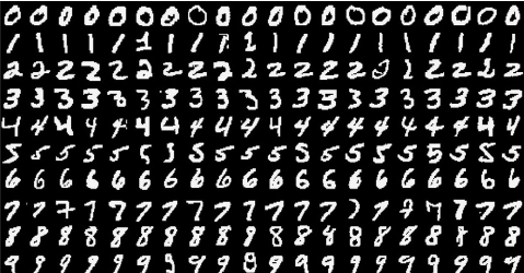 In this post, I'll use a well known dataset MINIST handwritten. There are
 70,000 images, each image in this dataset is of size 28x28.
First, import the libraries we are going to use.
import matplotlib.pyplot as plt |
I'm using matplotlib and seaborn for visualization. numpy and pandas to handle numerical arrays and dataframe. I'm also use scikit-learn to get the data and perform t-SNE.
Download the dataset
data = datasets.fetch_openml('mnist_784', version=1, return_X_y=True) |
(70000, 784)
The dataset downloaded has 70,000 records, each record has 784 columns.
Let's plot an image to see what does it look like
image = pixel_values[0, :].reshape(28, 28) |
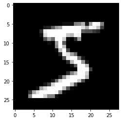
The image in the dataset has size 768, so I need convert it to 28x28.
Now the importance part, compute t-SNE
tsne = manifold.TSNE(n_components=2, random_state=42) |
(6000, 2)
In this example, I using only 6000 rows, and reduce the columns from 768 to 2. Enough for plotting the data to 2D chart.
Let's visualize the transformed dataset
tsne_df = pd.DataFrame(np.column_stack((transformed_data, targets[:6000])), columns=['x', 'y', 'targets']) |
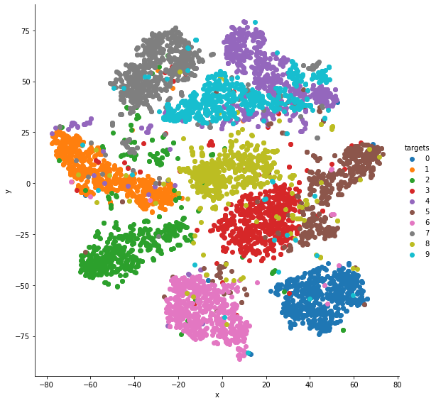
This is one way to visualize dataset. By plotting the dataset in the chart, we can see that, the number 0 and 6 are distinguishable easily. The number 4 and 9 are harder to distinguish.